
INIKIN伊刻活泉新概念包装
INIKIN
伊刻活泉是伊利推出的一款火山矿泉水。对于这类日常消费品项目,我们需要在兼顾生产成本与效率、物流合理性以及众多其他因素的前提下,通过设计手段提升产品的辨识度。
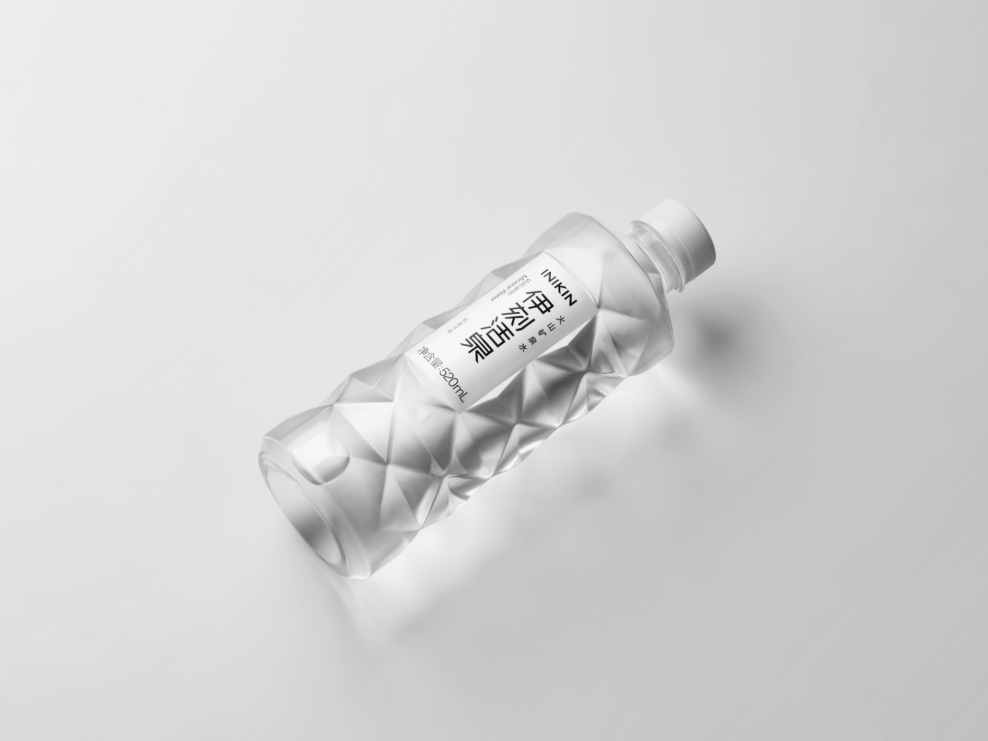
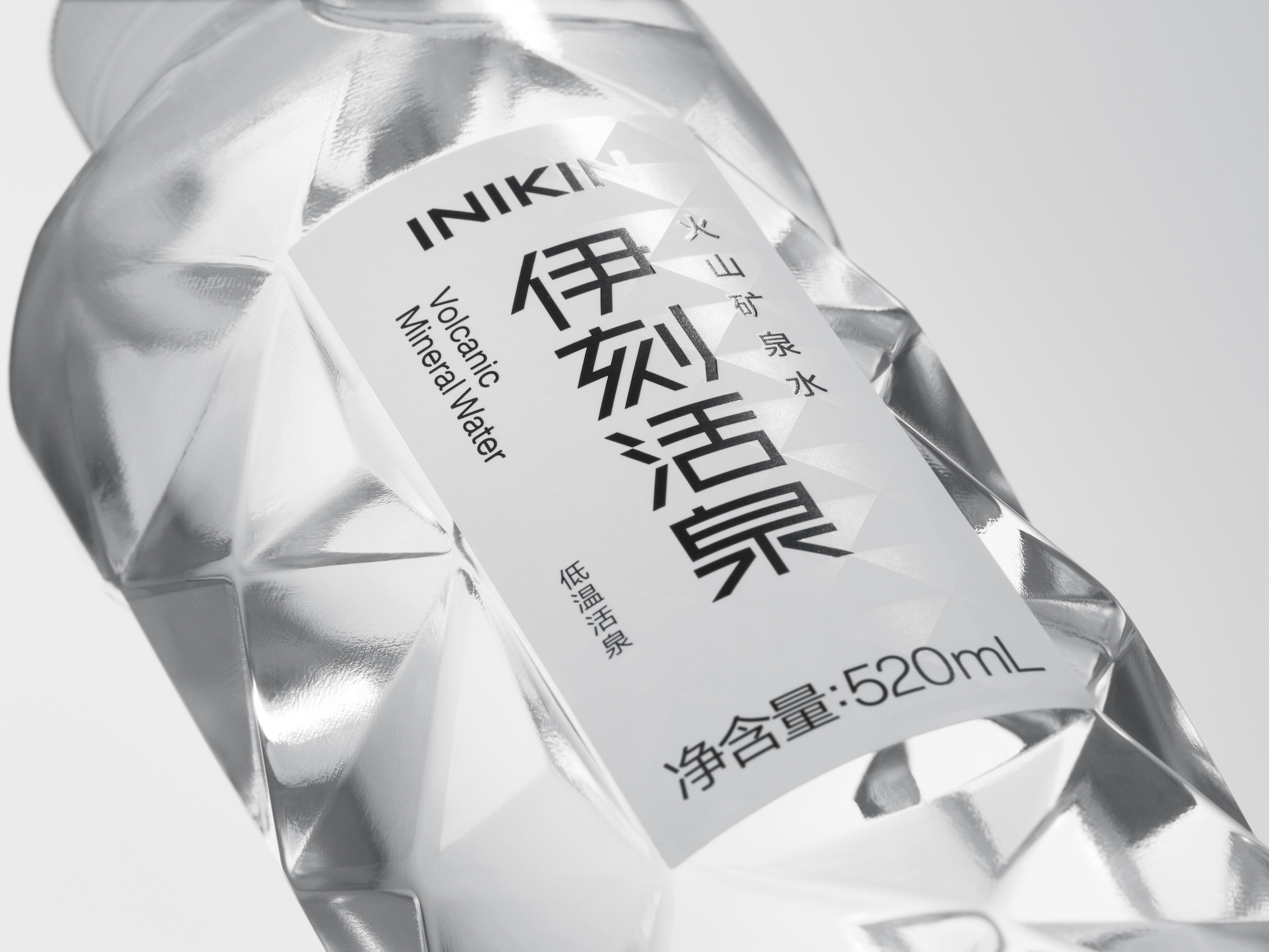
为了传达富含矿物质的水所蕴藏的活力,我们使用了几何化的方式来表现火山岩的外观。当水接受到光线时,光线在瓶内外重复着不规则的反射,形成绚烂的光影。让人们能够从视觉和触觉上感受到这种火山矿泉水的独特性质。
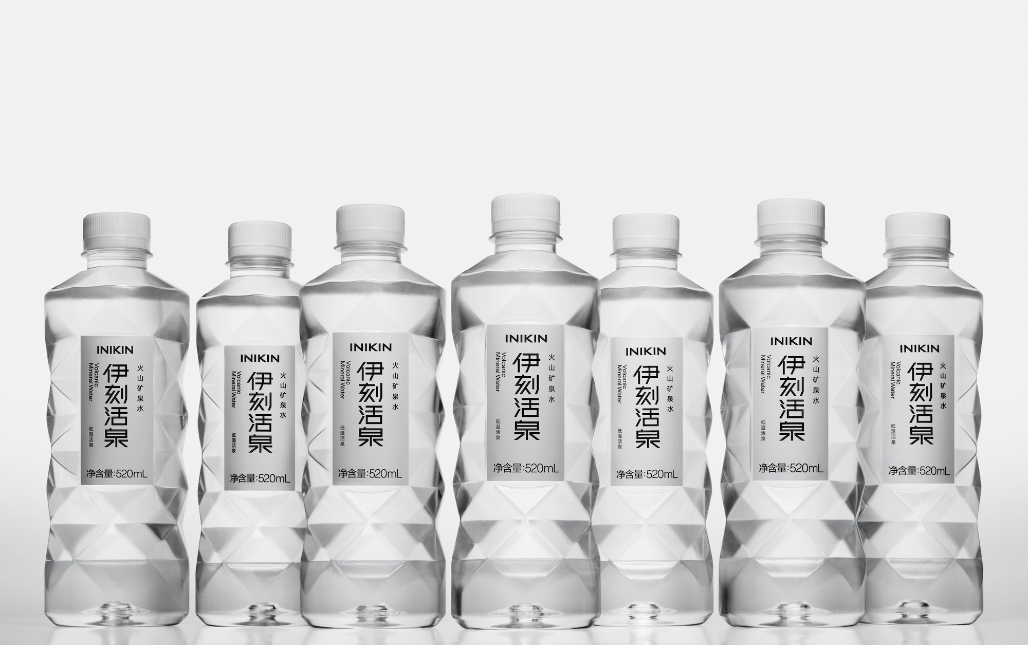
这个项目每个细节都聚焦在设计语言的精简与统一。标签的面积被最小化,以显示更多的瓶子的结构。字体标识与图形系统延续了具有标志性的三角形瓶型结构,瓶标背景上使用了UV工艺印制图案,以表达水的光泽感。
相比与常规的流线型设计,伊刻活泉的包装因其独特的几何化设计在瓶装水品类中而脱颖而出 。
INIKIN is volcanic mineral water launched by Yili. For this daily consumer project, we needed to improve the product's identification by design methods while balancing manufacturing costs and efficiency, logistic rationality, and many other factors.
To convey the vitality of mineral-rich water, we used a geometric expression of volcanic rocks. When the bottled water receives light, it repeats complex glittering and irregular reflections inside and outside the bottle. It allows the unique nature of this volcanic mineral water to be delivered visually and tactilely.
All details focus on the consistency and simplicity of the design language. The label area is minimized to show more of the bottle's structure. The brand's logotype and graphics continue with the iconic triangular elements of the bottle shape. To express the water gloss, we added a layer of graphics pattern on the label using UV coating.
In contrast to the conventional streamlined design, INIKIN's package stands out for its unique geometric design in the bottled water category.
瓶型设计:山中一宏
Product Design:Kazuhiro Yamanaka