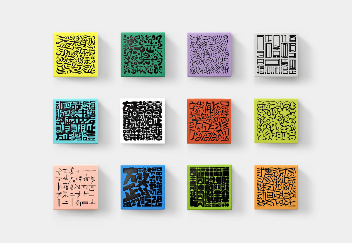
第十一届「方正奖」设计大赛视觉形象
Visual Identity for Founder Award 11
第十一届方正奖在传统的字体设计类别外,增设了全新的字体应用类别(品牌,海报,书籍,包装,动画)。以这种方式,强调字体在设计作品中的重要性。
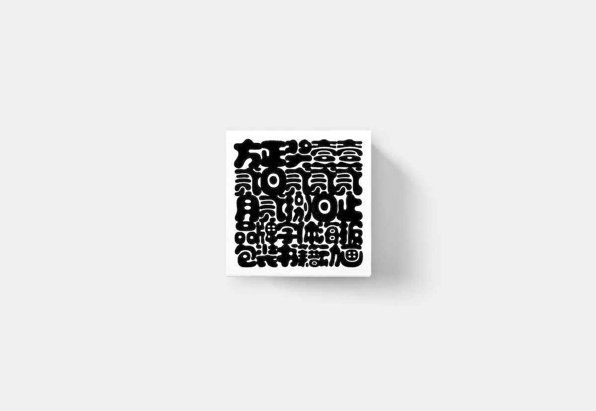
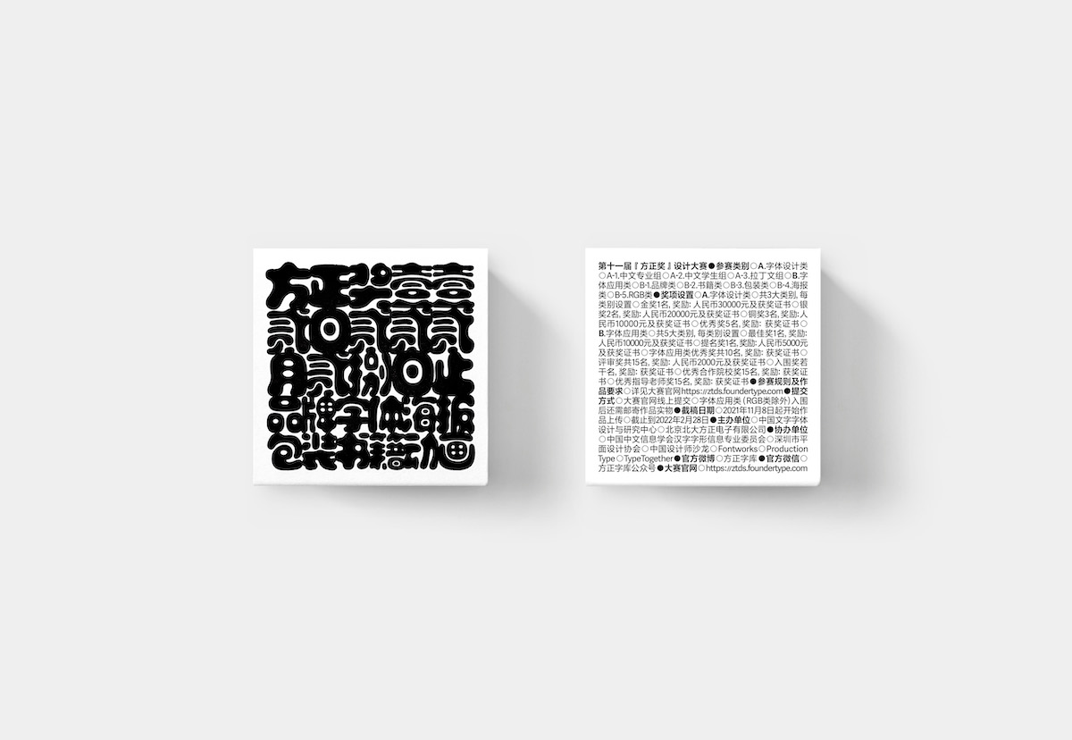
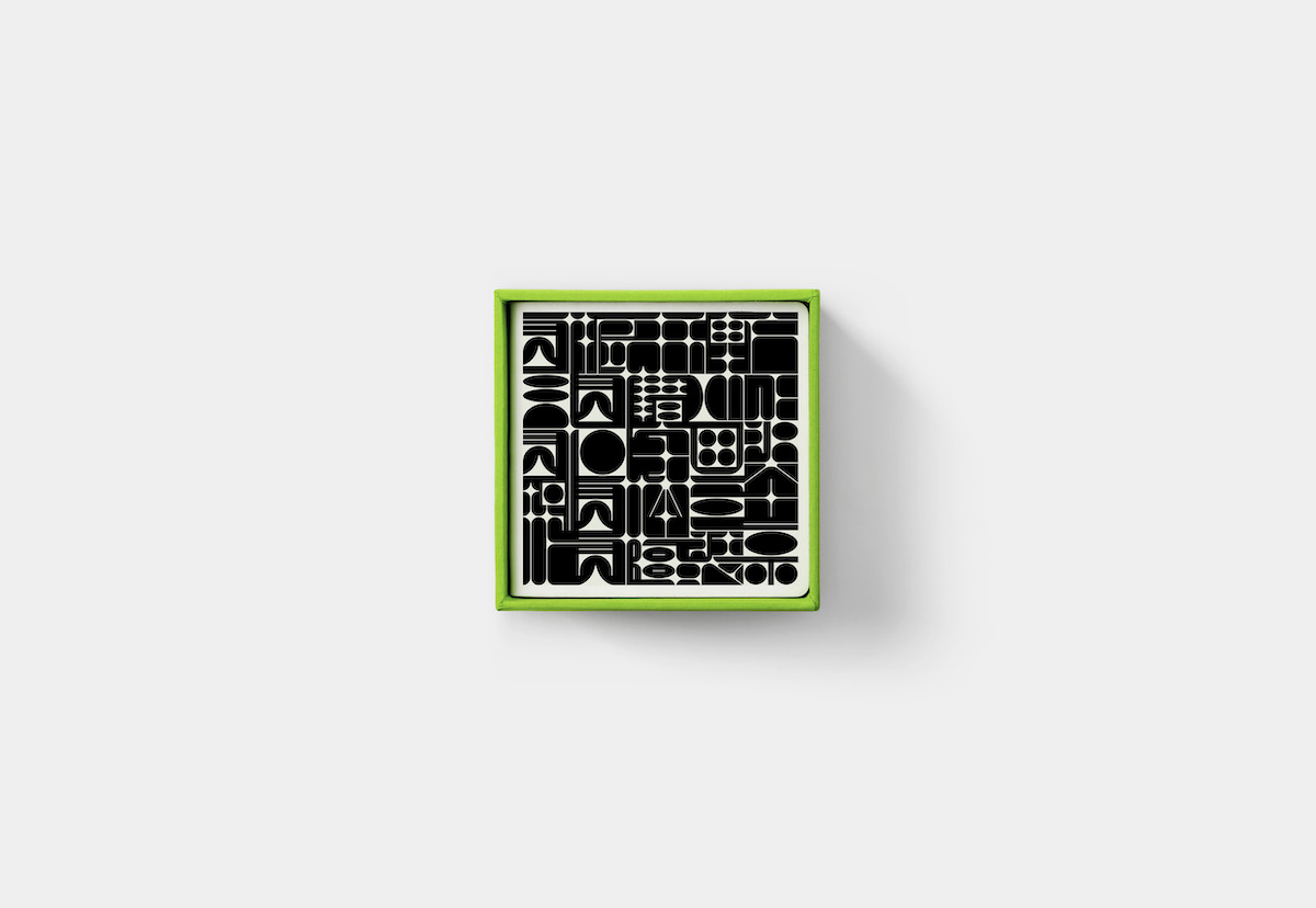
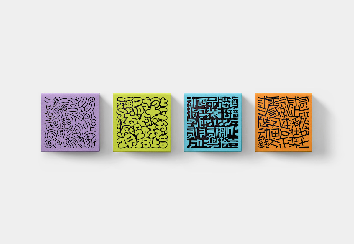
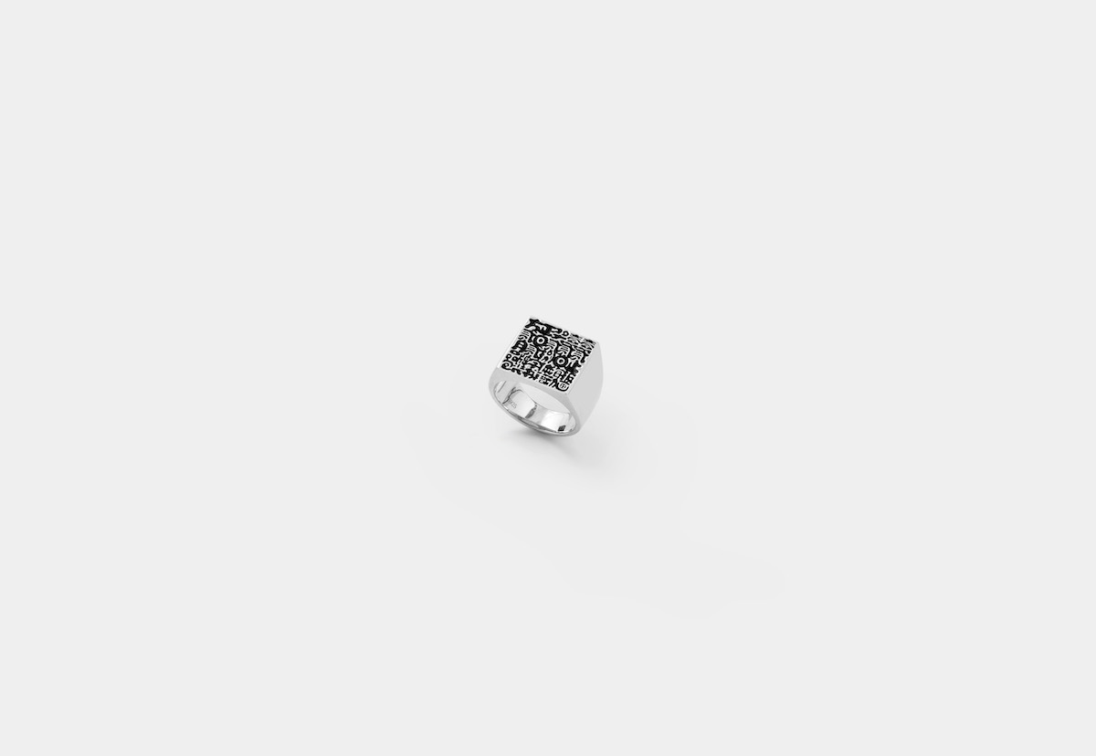
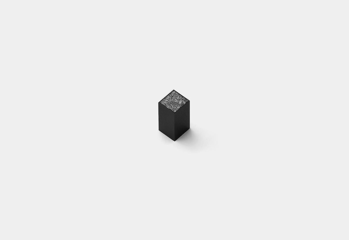
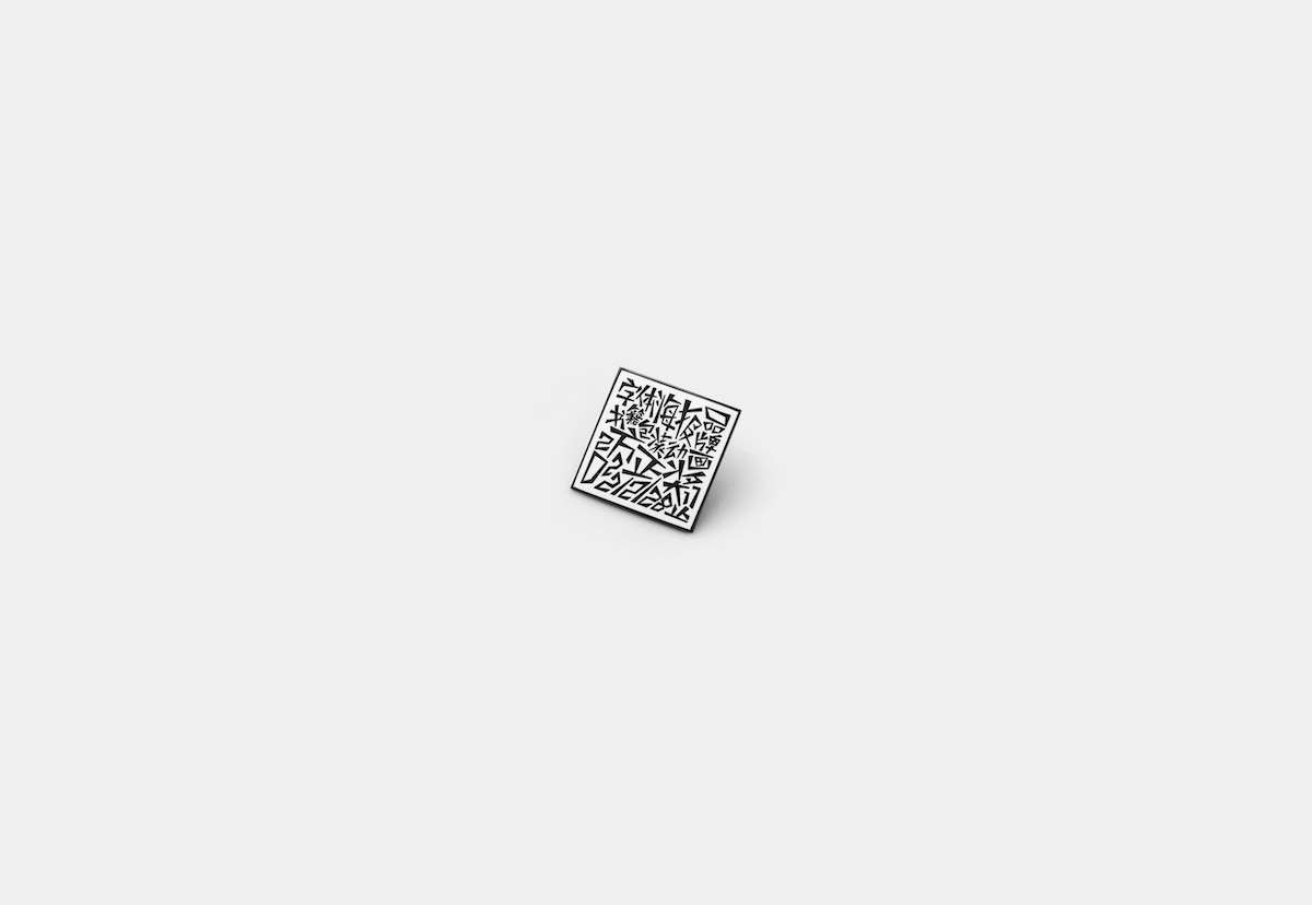
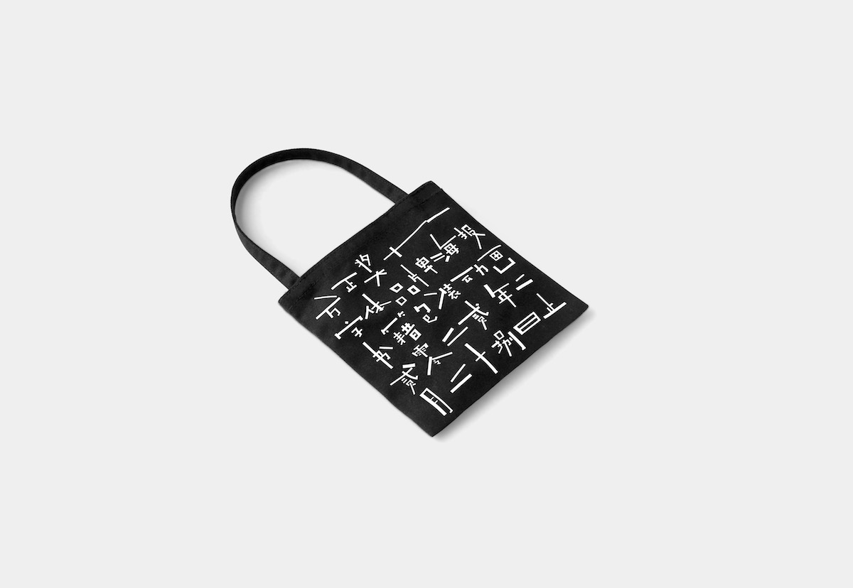
黑体与宋体因其排版的易用性和良好的识别性而广受欢迎,而有着强烈特征的创意字体却很少被专业的设计师关注并使用。我们试图打破这种固化的常规,探索这些“小配角”的多种可能。基于方正字库的一些创意字体,以比赛信息作为文本重新做了字形的设计。这些“图案”展示出了由字体带来的迥异特征。我们希望它们除了“作为信息被阅读”外,还可以“作为图案被观赏”。
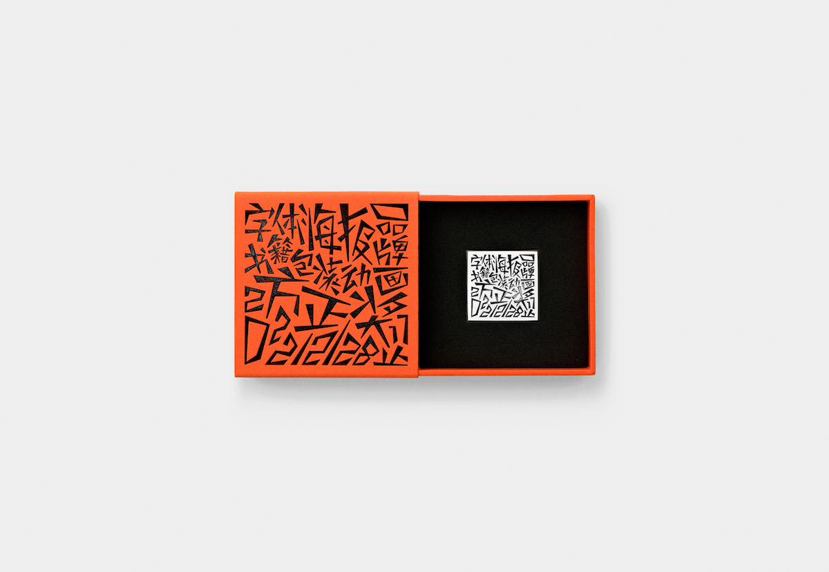
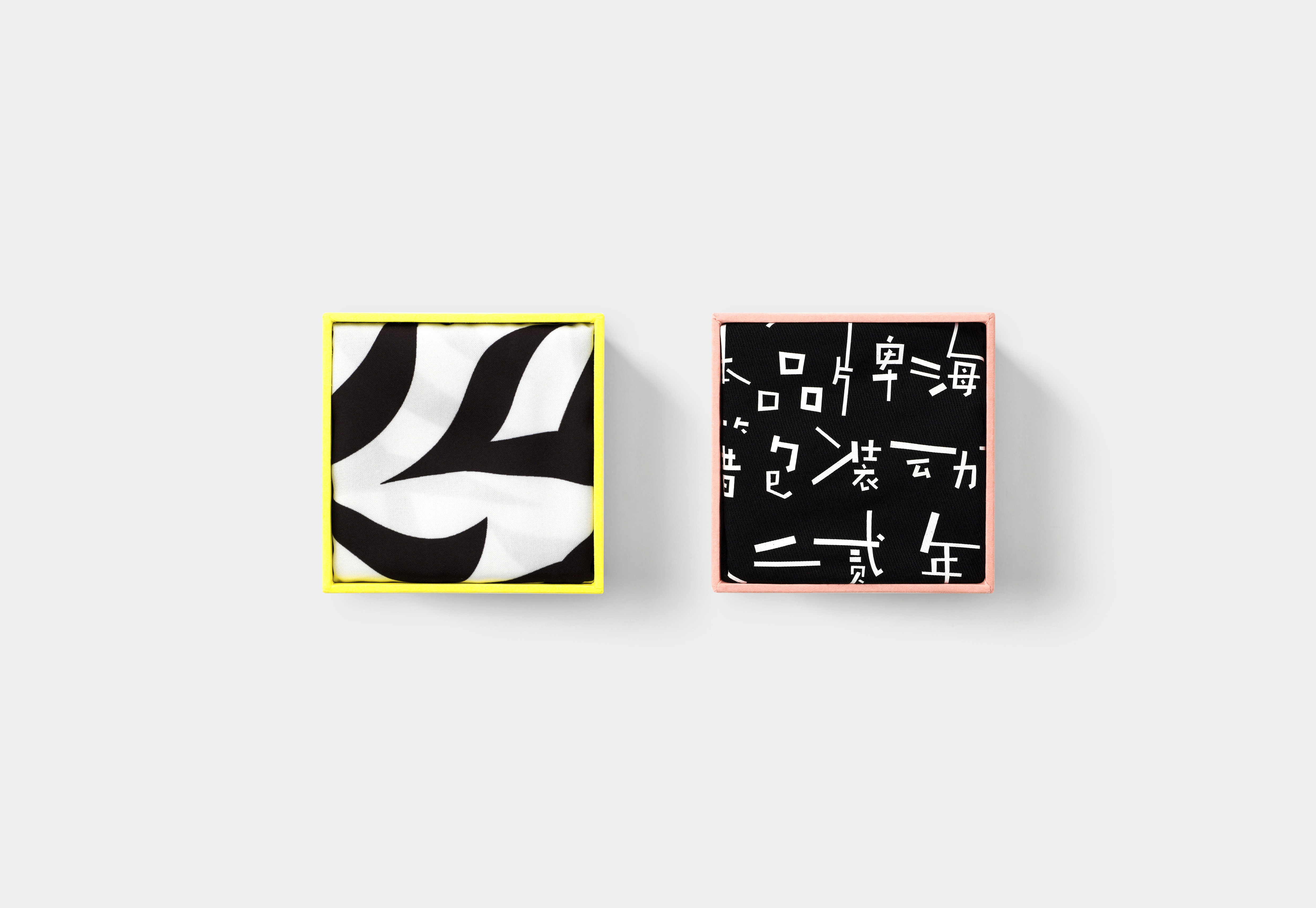
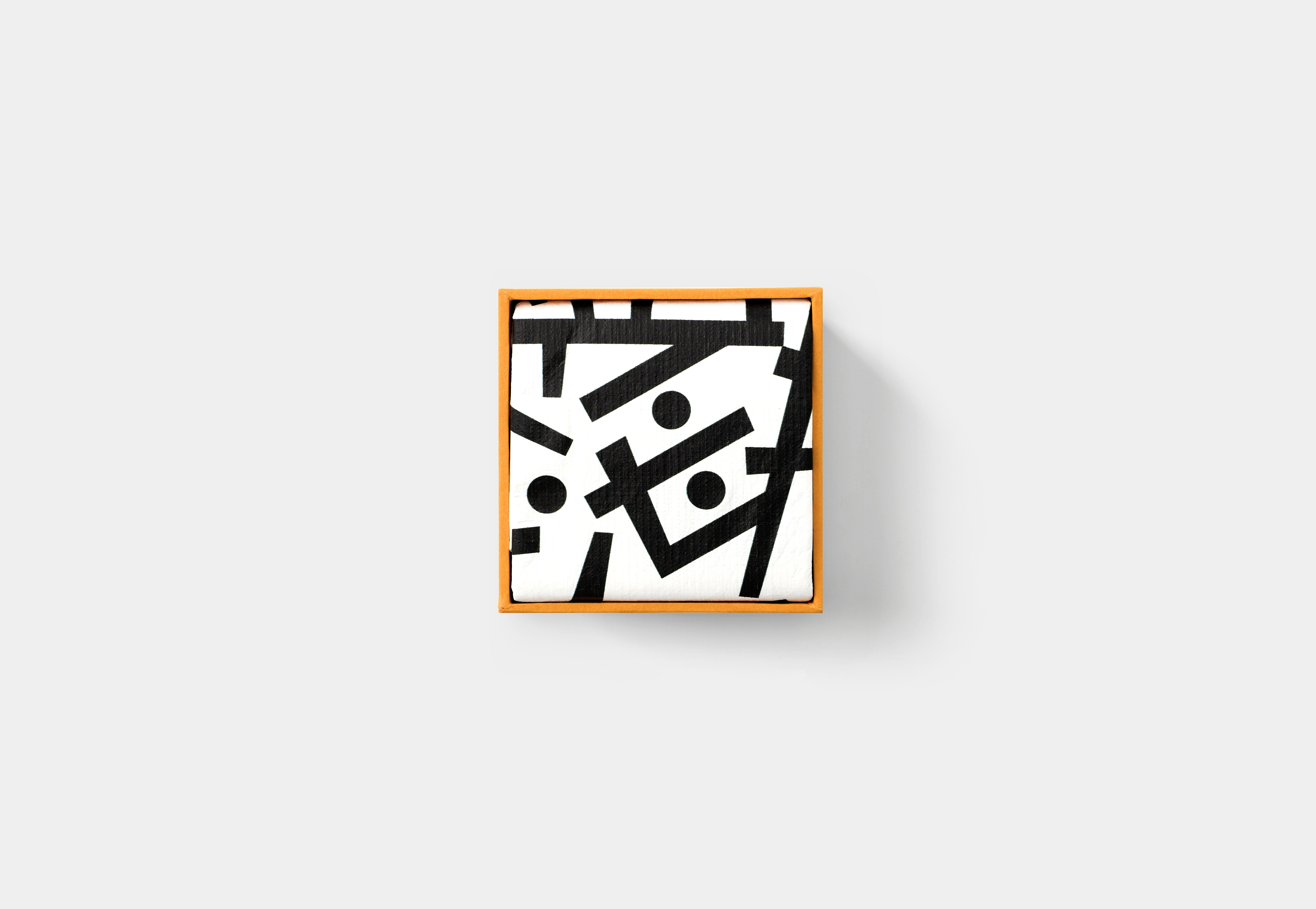
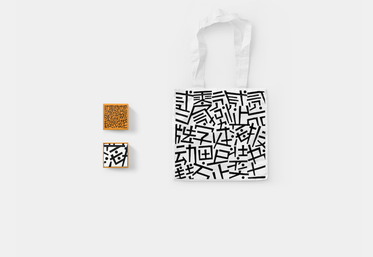
将“礼物盲盒”为概念,风格不同的图案被制作成各种礼物以盲盒的形式随机赠送给设计师。期待这些形形色色的“小东西”可以让各位爱不释手。
In addition to the font design category, Founder Award 11 set a font application category (brand, poster, book, packaging and animation)this year. In this way, emphasize the importance of typefaces or fonts in design works.
Gothic and Mincho fonts are widely used in today’s graphic design with the advent of typography and recognition. In comparison, creative fonts with distinctive features are being disregarded. We tried to break the rigidity and explore the possibilities of these minor roles.We redesigned several FounderType fonts using competition info as text. These graphics show different features brought by fonts. We hope they can be enjoyed as patterns besides purely read as text.
With “blind box” as a concept, these patterns are made into various gifts and randomly presented to designers who might concern this competition. We are looking forward to everyone could handle them and like them.